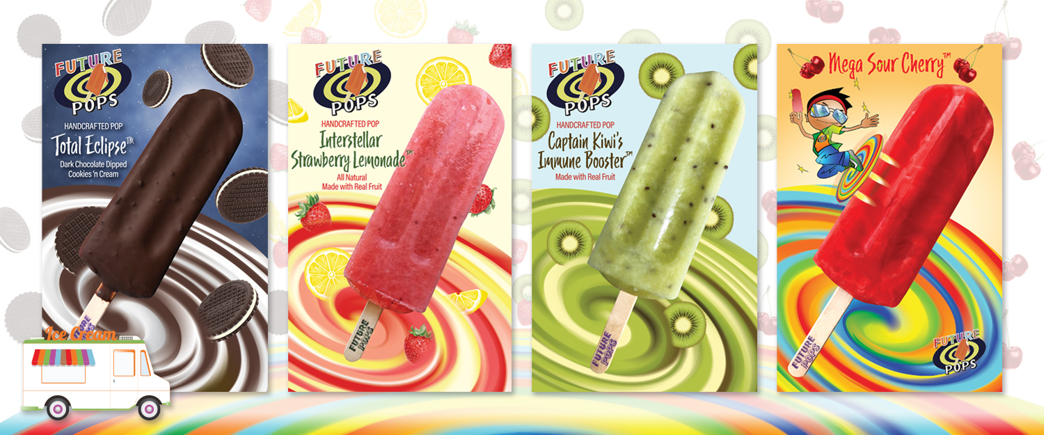
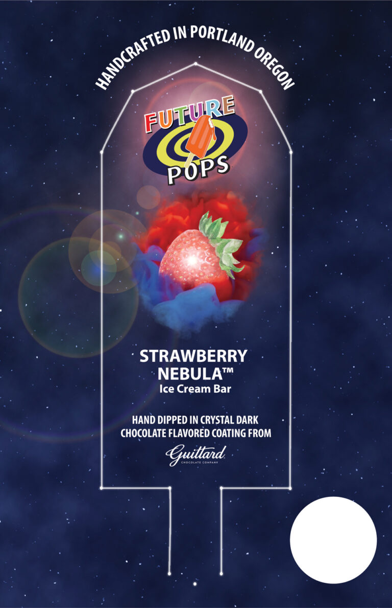
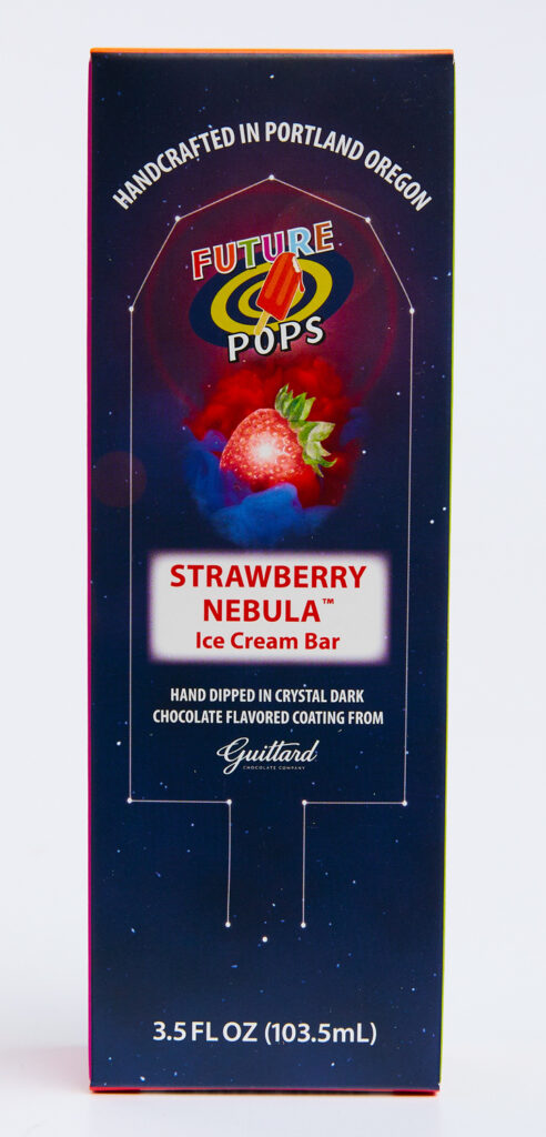
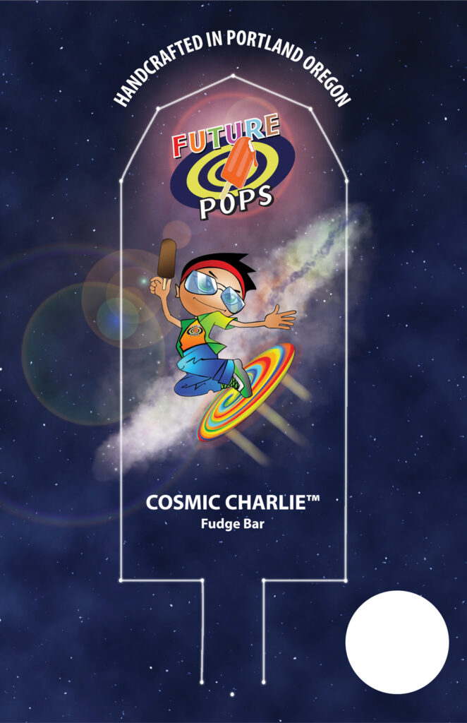
Mick is a sci-fi, time travel, Doctor Who kind of guy. He had incorporated the idea of time travel into his product name and logo and wanted to continue that same theme in the names of his pop flavors, labels, and stickers. I visited his Portland facility and we talked about his ideas and interests for his product. Later, I showed him my own ideas that came from that discussion.
We landed on the creamy swirling image for the truck stickers as a reference to the swirling of the “time tunnel” that intrigued Mick when he had watched science fiction shows as a kid. The image doubles as a swirling base mixture for the flavor ingredients as they fall in and combine to make the final taste experience. The fruit falling is a visual testimony to the all-natural fruit ingredients. A bright color palette was used for most of the stickers and labels to appeal to school age customers.